
Are Your Messages Easy to Read?
Creating content for LED digital billboards is different than creating content for print ads. With that in mind, let’s take a look at typography today. Remember your viewers have a limited amount of time to read your messages, so it’s important to choose an easy-to-read typeface. Here are some simple tips to help you create […]
2/18/2015
Categories: Out of Home Advertising
Creating content for LED digital billboards is different than creating content for print ads. With that in mind, let’s take a look at typography today.
Remember your viewers have a limited amount of time to read your messages, so it’s important to choose an easy-to-read typeface.
Here are some simple tips to help you create messages people can read from different viewing distances and angles:

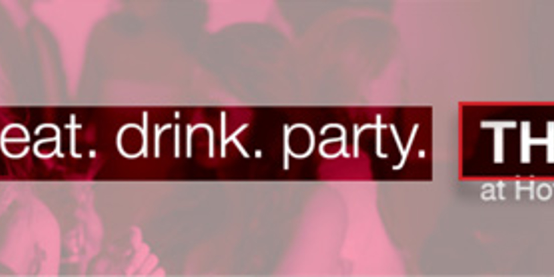
Vary upper and lower case for longer messages.
- Use large, bold fonts.
- Select sanserif fonts for headlines.
- Outline letters or use drop shadows to increase contrast.
- Vary the use of both upper and lowercase characters for longer messages (see text in example, right).
Find information about Daktronics Creative Services at: www.daktronics.com/creativeservices.