
Make It Pop! The Final Chapter: The Power of Grayscale!
Over the last few weeks we’ve been sharing tips with you about how to make your display messages pop. We’ve talked about using outlines, shadows, and even outlines and shadows together! We also mentioned the importance of adding depth and contrast to your messages. While most of us understand what depth is (think 3-D!), the concept […]
Daktronics Commercial Software Training on 3/30/2016
Categories: Venus 1500 Training
Over the last few weeks we’ve been sharing tips with you about how to make your display messages pop. We’ve talked about using outlines, shadows, and even outlines and shadows together! We also mentioned the importance of adding depth and contrast to your messages.
While most of us understand what depth is (think 3-D!), the concept of contrast can be a bit more difficult to understand.What is contrast? What is good contrast? How do you know if your message has good contrast? Today, we are going to help answer those questions for you!
What is contrast?
The folks who write our Out of Home Advertising blog did an absolutely wonderful job of explaining contrast in an article posted earlier this month.We highly recommend that you read this post before going any further. Click on the link below.
We’ll see you in a few minutes!
Understand Contrast In 5 Minutes
Welcome back! Now that you’re an expert in understanding contrast, we can move on to other questions you had and offer some simple solutions to use going forward.
What is good contrast?
Throughout the years, we have blogged about contrast on many occasions, and Daktronics also provides an excellent tool in our Complimentary Best Practices Brochure that covers contrast in great detail.
However, because we are still in the midst of March Madness, we thought the best way to explain good contrast would be to direct you to one of our most read and most popular posts of all time.
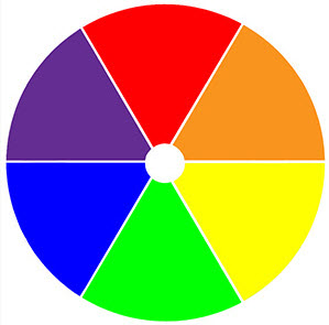
Now that you’ve read (or re-read) that classic post, you know not only how important it is to create messages with high color contrast, but that alternating colors in a standard color wheel produce the best combinations, similar to the logo of your favorite college basketball team!
How do I know if my message has good contrast?
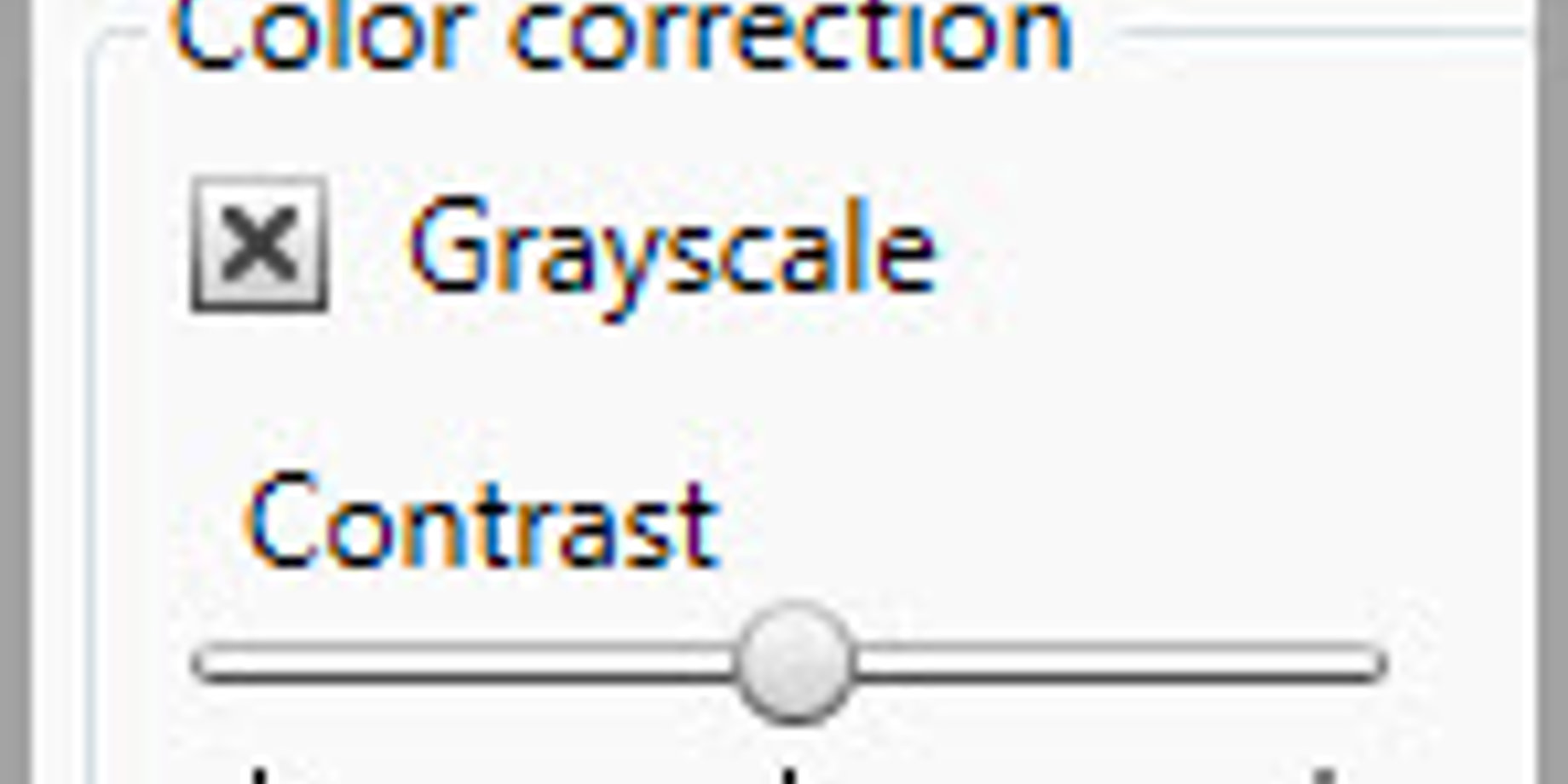
On to the most difficult question to answer, and the namesake of this very post! Grayscale is an image that shows only intensity information and is composed entirely of shades of gray. And no, we aren’t talking about that novel!
You might be asking yourself, what does grayscale have to do with me? Well, it can be used to confirm whether or not your message has good contrast! Grayscale images are unique in that they vary from black at the weakest color intensity, to white at the strongest color intensity.
So by comparing the shades of gray in your image to one another, you can tell if your message will stand out (pop) from the background or not.
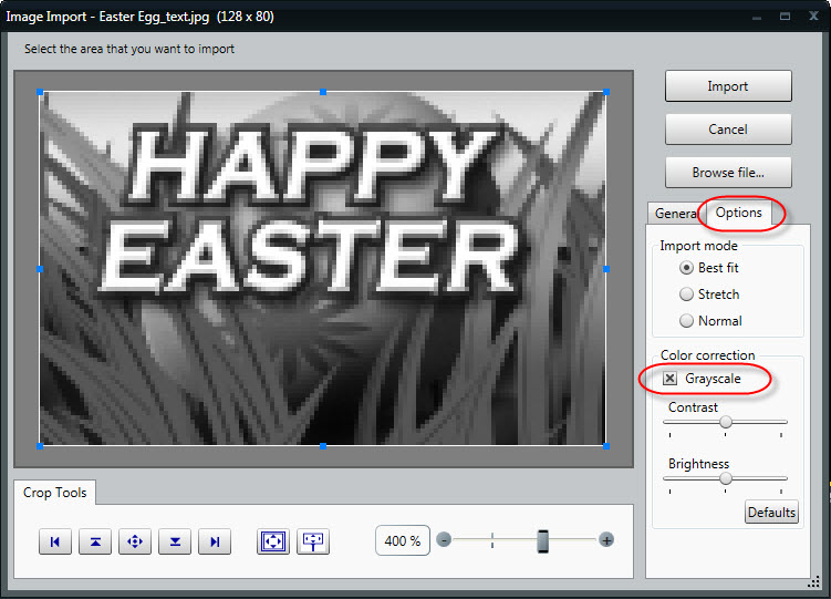
The good news is Content Studio has grayscale built in! Take a look at the images below. The first image is a picture from the Daktronics media kit in the import window.The second picture is the same image, but with grayscale selected in the Options tab.This allows us to see that the text does stand out from the background, so we know that we have good contrast!
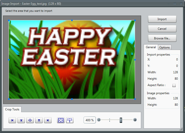
Obviously that was a picture from the Daktronics media library, like I mentioned, so of course it’s going to have good contrast. How can you use the power of grayscale when you are creating your own message, though? By using Scrolling Text, that’s how!
How do I test a message for good contrast?
Last summer we wrote an article about little-known features in Venus 1500 V4 and Content Studio. In that post we explained how to save scrolling text as an image and why you might want to do so.
Well, guess what? We just found another reason! Before we get ahead of ourselves, maybe we should review. Take a look at the post below (just the section titled Saving Scrolling Text as an Image), and then meet us back here. Ready? Break!
I didn’t know I could do that! Part Three: Odds and Ends
Long time, no see! All right, now that you’re back and you know how to save scrolling text as an image, we can continue.
- We know that the Image Import window contains the grayscale option.
- We know that scrolling text messages can be saved as images.
- Then, Scrolling text messages can be imported as images.
- And we can use grayscale on our scrolling text message in the Image Import window.
Why would we ever want to do that?
Well, for starters it’s a sure-fire way to check and confirm if your message has good contrast. Also, it honestly took me longer to explain it than it’s going to take you to actually do it!
Keeping the knowledge in mind that you’ve acquired so far, let’s begin our contrast test!
- Create a scrolling text message with the background color, font color, size, and type you want your new message to have.
- Save the scrolling text message to your desktop.
- Browse to the scrolling text message and double-click to get it into the Image Import window.
- Click on the Options tab and put a check mark next to Grayscale.
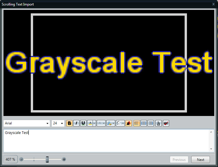
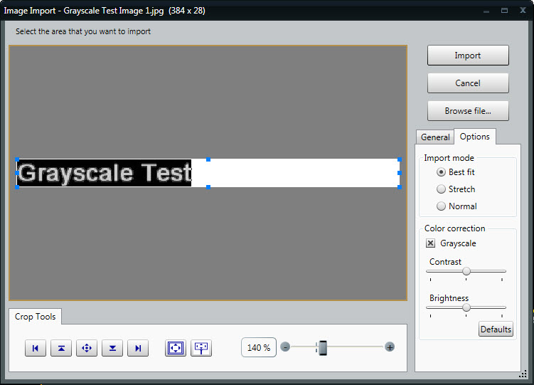
Does your text clearly stand out (pop) from the background, or is it blurred together in similar shades of gray? If it pops, you have good contrast and can create your message! If it blurs together, you know your message doesn’t have good color contrast, so you shouldn’t use it. It’s that simple!
If you found this post helpful and enjoy reading our blog, then be sure to click on the orange ‘Receive Email Updates’ button on the right side of the screen.
Thanks for reading. See you next time!