
Monochrome Miniguide
This week, we will focus on a topic that has been a long time coming. For those of you who have monochrome displays, today is your lucky day! We have put together a best practices guide just for you. Today’s blog will cover the best practices of content creation for monochrome displays. We’ll also include some […]
Daktronics Commercial Software Training on 9/21/2016
Categories: Venus 1500 Training
This week, we will focus on a topic that has been a long time coming. For those of you who have monochrome displays, today is your lucky day! We have put together a best practices guide just for you.
Today’s blog will cover the best practices of content creation for monochrome displays. We’ll also include some ideas to help you get the most out of your display, whether it is red or amber, big or small.
Let’s do this!
Content Creation Best Practices
An LED display can show a variety of font sizes with messages changing every few seconds. In the example below, we show you the capability of using multiple lines of text on a LED display in the “What’s Possible” column. You can clearly see that a message with multiple lines of text isn’t the most effective content. The text is too small and close together for people to easily read as they pass by.
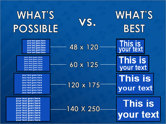
Instead, it is better to create brief messages in a font size that fills the entire display, as the examples under the “What’s Best” column show. People often tell me that their message is too long, so they have to make the text smaller so it fits. When I hear that, I recommend 2 different options that will look better on their display.
- Spread your message out over multiple layouts within the same presentation so that they play back to back. If you are worried people will get confused or miss part of the message, then give each layout the same background and the same font style and size so they match.
You can also use effects, like the “Scroll Left” transition that will make all the layouts look like they are following each other.
- Shorten your message. Try to paraphrase your message to make it shorter or simply get rid of the extra words that you don’t need. Stick to key words and avoid redundancy.
We posted to the blog a while back about converting traditional advertisements to digital media. You should definitely check out that post. It gives some great examples of what you can do to get your entire message across and still end up with a high-quality message on your display.
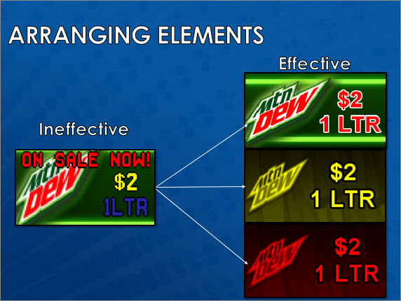
Trainer Tip: Remember to keep your message as brief as possible, using only two or three elements. We’ve provided examples of ineffective content and effective content below. You can see in the ineffective example that there are too many elements, too much information, and same-sized elements, so the text doesn’t flow naturally. Whereas in the effective example, there are fewer elements, the most important element is big and bright, the text is large using all the available space, and the graphic supports the message.
Backgrounds and Outlines
If you have a monochrome display, then you should absolutely take advantage of the backgrounds found in the free Daktronics Media Kit to enhance your content. The Media Kit gives you the option to spruce up your message and another way to gain people’s attention.
Give it a try! Instead of using the same plain old black or amber/red background, use an image from your media library. One thing to note is that the images in the media library will be full color, but when you import them into your layout, they will show up in shades of your monochrome color. This gives you a true preview of how the images will appear on your display.
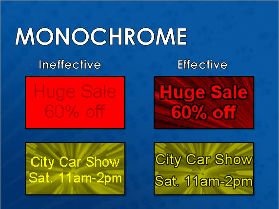
When using a background, we recommend applying a black outline to the text for the greatest readability. Outlines add contrast and depth and make your messages more noticeable and easier for people to read. If your font isn’t too small, try a 2-pixel outline to really make the text pop!
Unfortunately, we are unable to support small display sizes with Media Kit and package content due to there being too few pixels to ensure quality images, textures and logos. We recommend text-only messages to best optimize your display technology.
Typically, we offer the full media kit for displays that are 32-pixel high or more. However, we may be able to provide limited media kits for 24-pixel high displays.
If you need assistance with creating messages for your display, please visit the Venus 1500 Learning Center or contact one of our professional trainers by visiting our Contact A Trainer page.
Utilizing the Character Map
For those of you with smaller displays, we recommend using the character map, specifically the “Graphic” font found in your “Venus Fonts” list. Venus fonts are great for smaller displays and were created for the Venus 1500 software. We have an entire blog series that talks about smaller displays and how to use the character map. Go check it out!
Small Display Help – Using the Character Map to Add Interest
Small Display Help 2 – Scrolling a Graphic
Small Display Help 3 – Getting the Most Out of Your Display
We hope you learned something new and found this week’s post helpful! If you would like to subscribe to our blog, then be sure to click on the orange “Receive Email Updates” button on the right side of the page. Like we always say, thanks for reading!