
Typography . . . What’s That?!
Welcome back to the blog, dear readers! This week we’re going to talk about typography. We’ll take a look at what it is, where to find it, what it is, how to use it, and did I mention what it is?! You see, in order to understand typography, you must first understand typography! Typography (what […]
Daktronics Commercial Software Training on 6/21/2017
Categories: Venus Control Suite Training
Welcome back to the blog, dear readers! This week we’re going to talk about typography.
We’ll take a look at what it is, where to find it, what it is, how to use it, and did I mention what it is?! You see, in order to understand typography, you must first understand typography!
Typography (what it is)
According to Merriam-Webster, the definition of typography is, “The style, arrangement, or appearance of typeset matter.”
The word, “typography,” derives from the Greek words τύπος typos “form, impression” and γράφειν graphein “to write.” The word traces its origins to the first punches and dies used to make sales and currency in ancient times, which ties the concept to printing.
Typography is the art and technique of arranging type to make written language legible, readable, and appealing when displayed. The arrangement of type involves selecting typefaces, point sizes, line lengths, line-spacing, letter-spacing, and adjusting the space between pairs of letters.
To put it simply, as far as Venus Control Suite is concerned, Typography refers to your Font Options.
Typography (where to find it)
You may have already found it, but if not, the Typography drop down is located in the Web Compositor. If you have seen it, and wondered to yourself, “What in the world is that?” don’t worry, you’re not alone. We all thought the exact same thing!
The Typography dropdown will appear under the Properties column whenever you enter text into your canvas. The text can be inserted using a Text Box or from a data field. Once you have clicked on the “Add Text Box” or “Add Data Field” buttons above the canvas, you will see the Typography dropdown show up under Properties.
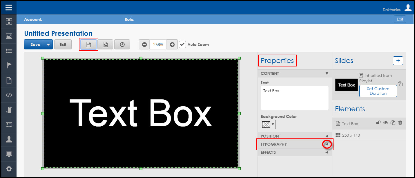
As we explained previously, the Typography dropdown will provide you with all your font options. So, go ahead and click that dropdown arrow to see all those options appear!
Typography (how to use it)
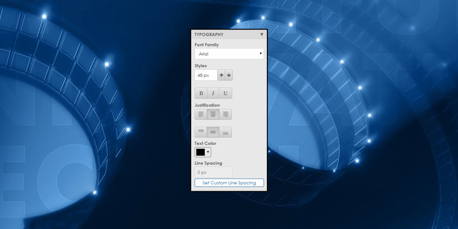
Now that you can see the Typography dropdown menu, you will see all the font options available for you to use. Because you have 5 sections to choose from, we’re going to break each one down separately for you.
1) FONT FAMILY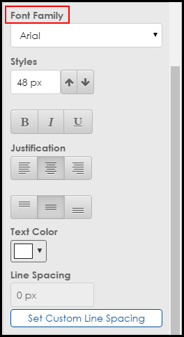
Font Family refers to the drop-down list of all the available fonts you can choose from. Some of these fonts may sound unfamiliar, but no worries. Our Creative Services team here at Daktronics thoroughly tested each one of these fonts. They will all look good on your display!
You see, font choice is critically important to your audience for understanding and readability. Thin fonts only light up one row of pixels on your display, so they are difficult to read from a distance.
Fancy, ornamental, or novelty fonts do not look good, either. Like the italicized fonts, fancy fonts run diagonally across the LEDs on your display.
We recommend selecting large, bold fonts that are easily read from different viewing angles and distances.
It’s a good thing for you that Daktronics went through about a zillion fonts and chose only the best fonts for your display, so now you don’t have to spend so much time searching for, and trying out, different fonts.
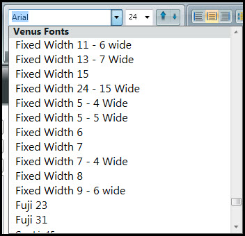
Choose from two different categories of fonts. First, we have True Type fonts, which are good for branding purposes.
And then there are Venus fonts. These fonts were specifically designed for Venus software. They are best used on smaller displays and have the font size listed next to them in the Font Family dropdown.
Trainer Tip: Our Content Editors, Web Compositor and Content Studio, both have the same fonts available to choose from. This is great for people who like to stay consistent with their font selection!
2) STYLES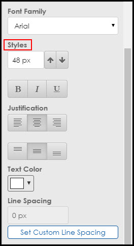
Styles refers to the size of your font selection. You can use the up or down arrows to the right of your font size to make your text larger or smaller. You can even type in a font size of your choice when you have chosen a True Type font.
If you are using Venus fonts, you will not be able to type in a size or use the arrows. You will just choose the Venus font that has the size you are looking for listed next to it in the Font Family dropdown.
Then we have the ability to Bold, Italicize, and Underline our text. As I’m sure most of you are familiar with these options, I won’t elaborate further.
Just remember, if you are going to italicize something, make sure that the text is large and bold first. I should also mention that these options are not available for Venus fonts.
3) JUSTIFICATION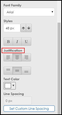
Justification allows you to align your selected text to the left, center, right or top, middle, and bottom of your text box. The biggest thing to remember about justifying your text is that it justifies it to the text box, not to the canvas itself.
Trainer Tip: In order to avoid your text getting cut off or shifting to the wrong place on your display, make sure that you don’t have any extra enters, spaces, or returns before or after your text in the text box. For more information, please read the Knowledge Base article below.
4) TEXT COLOR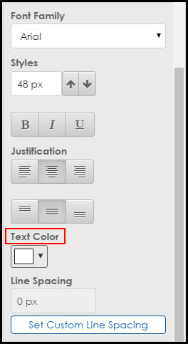
If you click on the Text Color Dropdown Menu under Text Color, it gives you the option to choose color for your text. You choose the color by clicking and dragging the gray bar on the right side of the menu to the color you like best.
Then choose which shade of that color you want to use by either clicking into the square of color or clicking, then dragging and dropping the black dot.
Do you know the certain specific color for branding purposes or for a logo? If you know the RGB Value of that color, type it into the bottom portion of the menu to select that exact color.
And to make things even better, any color that you apply to your background, text, or effects  will be saved as a previously used color. The colors will appear as little squares to choose from on the left side of the menu! Now you don’t have to waste time or energy trying to match your colors anymore!
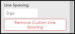
5) LINE SPACING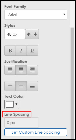
Sometimes when you have multiple lines of text in a message, it can seem like they are too far apart or too close together. This can throw off the balance of the whole message. Line Spacing lets you prevent that from happening before you publish to your display!
Simply click on the blue button that says Set Custom Line Spacing. The button will now be red and say Remove Custom Line Spacing. Go ahead and click into the white field above the button and type a number.
A positive number (1) will move the lines of text one pixel farther apart than they were before. A negative number (-1) will move the lines of text one pixel closer together than they were before.
Now that you know all about Typography, use all the tools in the Typography dropdown to create the best-looking content ever!
For even more information about creating the highest-quality content possible, you should check out our Best Practices of Content Creation brochure by our Creative Services team!
Thank You!
Like we always say . . . (and mean!), thank you so much for taking the time to read our blog! If you find it helpful, please click on the orange “Receive Email Updates” button on the right side of the page to subscribe.