
Best Practices Breakdown: Font Options
Welcome to part 2 of our series on the best practices of content creation. This time, we’ll talk about choosing the best fonts for your messages. If you’ve been reading our blog for a while, you already know that typography means “font options.” To put it simply, typography is the arrangement and appearance of type […]
Daktronics Commercial Software Training on 10/11/2017
Categories: Venus Control Suite Training
Welcome to part 2 of our series on the best practices of content creation.
This time, we’ll talk about choosing the best fonts for your messages. If you’ve been reading our blog for a while, you already know that typography means “font options.” To put it simply, typography is the arrangement and appearance of type on a page, or in our case, on a display.
Font Size
When it comes to choosing a font size, we recommend selecting large, bold fonts that are easily read from different viewing distances. Your audience will have an easier time reading and comprehending your message.
Another guideline to keep in mind is that even though LED displays can show multiple lines of text on a single message, that does not always result in the most effective content.
You see, if you try to squeeze too many lines of text onto a single layout or slide, the text will most likely be too small to read for those passing by. Not only that, but even if they could clearly make out the text, they wouldn’t have time to read through the entire message.
So, instead of trying to squeeze several lines of text onto a single layout or slide, it’s better to create brief messages in a font size that fills the entire display, as in the examples below. Plus, using a limited amount of text will help viewers’ readability and comprehension.


We often hear comments like, “I have more to say than what fits onto a single layout or slide,” or “I can’t fit my entire message onto a single layout or slide.” This is exactly why we recommend using multiple layouts or slides in a single presentation. That way it allows you to spread your message across multiple ‘screens’ that play back-to-back. If people can read the first part of your message clearly, then they will be more likely to continue reading the rest!
- How do I create a presentation using the Venus Control Suite Web Compositor?
- How do I add or remove a layout in Content Studio?
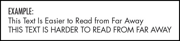
Trainer Tip: Remember to use text containing both upper and lower-case characters when you have a longer message. Limit using text with all caps to short messages or to key words to provide emphasis. This is our recommendation because using text that is all capital letters is harder to read and takes a longer time to read as well.
Font Types
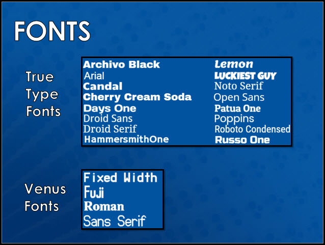
Readability is the key word here. Font choice is critically important to your audience for understanding and readability. Lucky for you, our Creative Services team here at Daktronics selected a whole host of TrueType Fonts for our content editors, making any font selection ideal for your LED display!

When using True Type Fonts, users can adjust the size by using the up or down arrows. Users are also able to bold, italicize and underline their text. Venus fonts are great for smaller displays and were created specifically for the Venus software. Their size is listed next to them in the font drop down.
Speaking of readability, here are some tips for making sure your font selection will stand out on your display!
- Bold/thick fonts are easier to read on a display. If the font is too thin, it gets lost on the display.
- Larger text uses more available space that helps viewing when at a distance.
- Some fonts might look good when they’re big, but are hard to read when they’re too small.
- In most cases, it’s easier to read upper and lowercase letters on a display. All caps has its place; use for emphasis.
- Two fonts can be used on a piece of content. One font as the main font and the other used sparingly as an accent font.
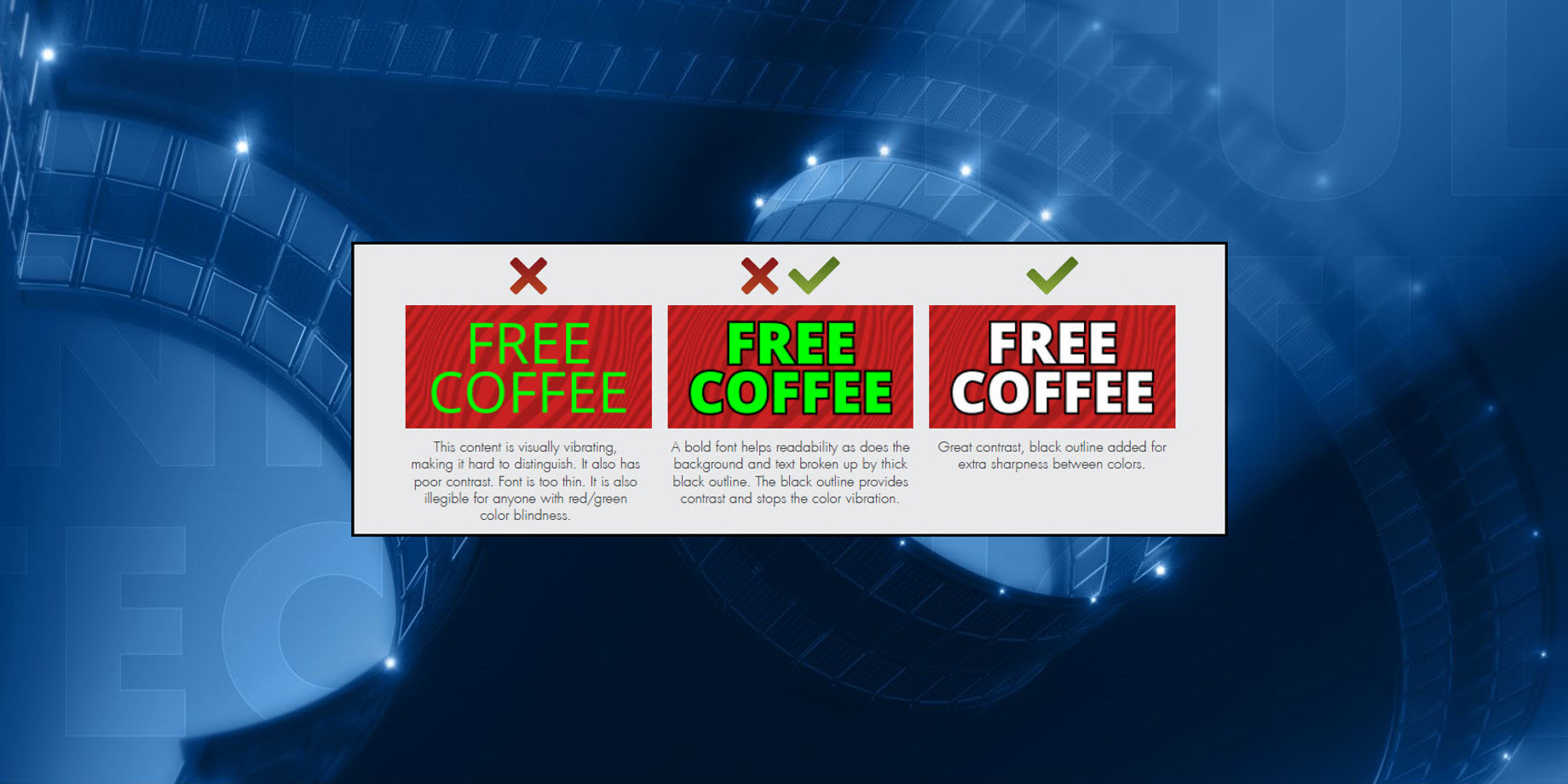
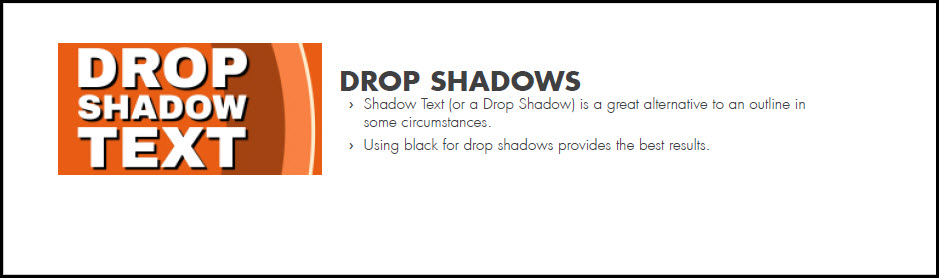
Trainer Tip: If you use a Serif font, bold it so the little strokes will be visible. Outlining letters and using drop shadows also increase readability! If your font isn’t too small, try a 2-pixel outline to really make the text pop!
Font Styles
When using colors on the display use rich, vibrant, saturated colors. Try to stay away from white and pastel colors. A good tip to follow when choosing colors for your message is to use a dark background.
Avoid white backgrounds. They may look appealing in other advertising media, but for a light emitting display, the harshness can repel the customers eyes.

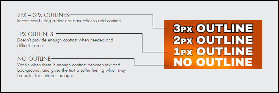
Depending on the background and the text color used, you may want to consider an outline. Sometimes an outline is the only difference between a good design and a bad one.
- Black/Dark outlines work the best and are easiest to read.
- The thicker the outline, the better the readability.
- 2px or 3px provides the best results.
We hope you found this post helpful when selecting fonts for your messages! Be sure to click on the orange “Receive Email Updates” button on the right side of the page to subscribe.
Thanks for reading!